Continuing on with my goal for 2013 of writing more blog posts I figured I’d go back and look at a neat use I found for Splunk and two kinds of data I was able to ingest in to it.
As Splunk has grown in popularity over the last year I started see more and more blog posts, twitter comments, etc regarding various uses for Splunk and most of the time I look over at my own dashboards and see items I’ve had in place for a long time being described.
Recently I came across a blog post from early January on Splunk’s own blog site entitle “Making Applied Math Interesting” which does a good job detailing how to use Splunk to examine time series temperature data. Reading this is made me initially think of a report I wrote that does exactly that but then added another layer of data….the human element.
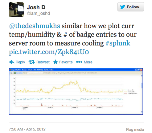
I think my tweet from almost a year ago now pretty simply sums it up:
And here’s a better close up on the chart itself…
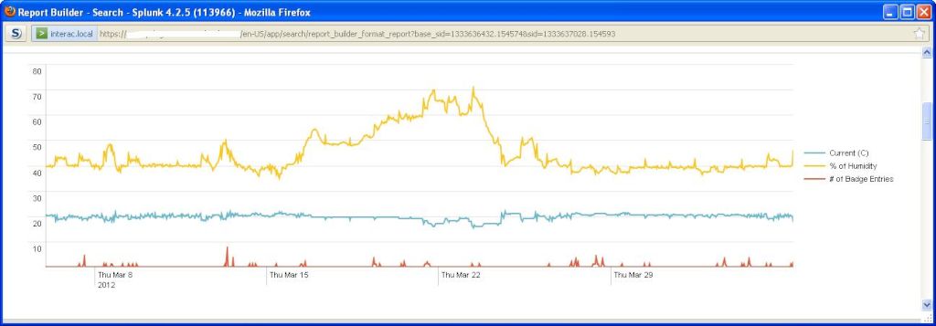
If you still haven’t figured it out… Two data sources come in to play here:
-
- Temperature and Humidity data from the Air Control units in the server room
- Physical Badge event data
Now combine the data and chart it and you can see if there’s any correlation between the human element in the server room and the temperature/humidity of the server room. Although there’s not a drastic effect of the number of personnel coming and going in the server room, you can see a big spike in the number of entries to the server room on or around March 13th does correlate with a 10% increase in the amount of humidity reported in the room.
Obviously there’s many other uses for this data and a number of reports that can be pulled out but for now I thought I’d share this.
Cheers.